

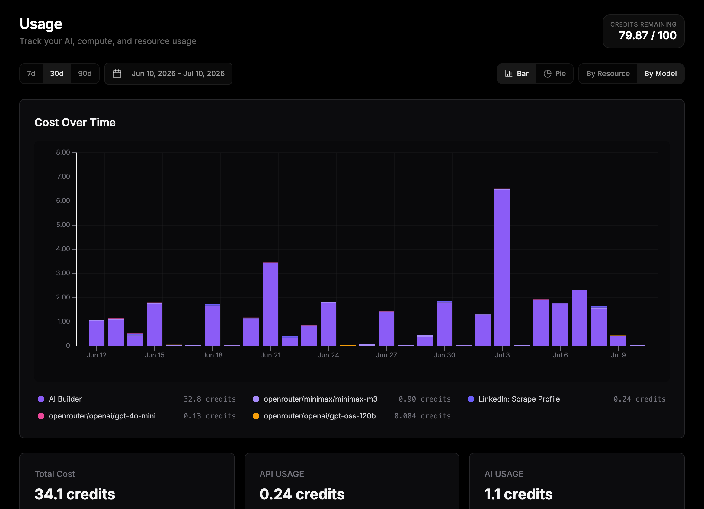
The usage dashboard with the stacked bar chart and summary cards.
Credits remaining
The top of the dashboard shows Credits remaining as used-versus-cap for the current month (for example87.50 / 100), combining your plan allowance and any active top-up.
Usage categories
Every charge falls into one of six categories:Charts and views
Two toggles control the main chart:- Bar / Pie: a stacked cost-over-time bar chart, or a donut showing each slice’s share of total spend.
- By Resource / By Model: group spend by the categories above, or by individual model and service (for example a specific LLM, Veo, or a scraper).
Date ranges
Use the 7d / 30d / 90d presets, or the date picker next to them to select any custom range.Recent usage events
The Recent Usage Events table lists your charges with timestamp, category, resource, count (for example tokens), and cost. New events appear in real time while your workflows run, so you can watch a run’s spend as it happens. Search the table by resource name and filter it by category to narrow the list. The table scrolls through your full history rather than showing only the most recent rows, and live events respect whichever filters you have active.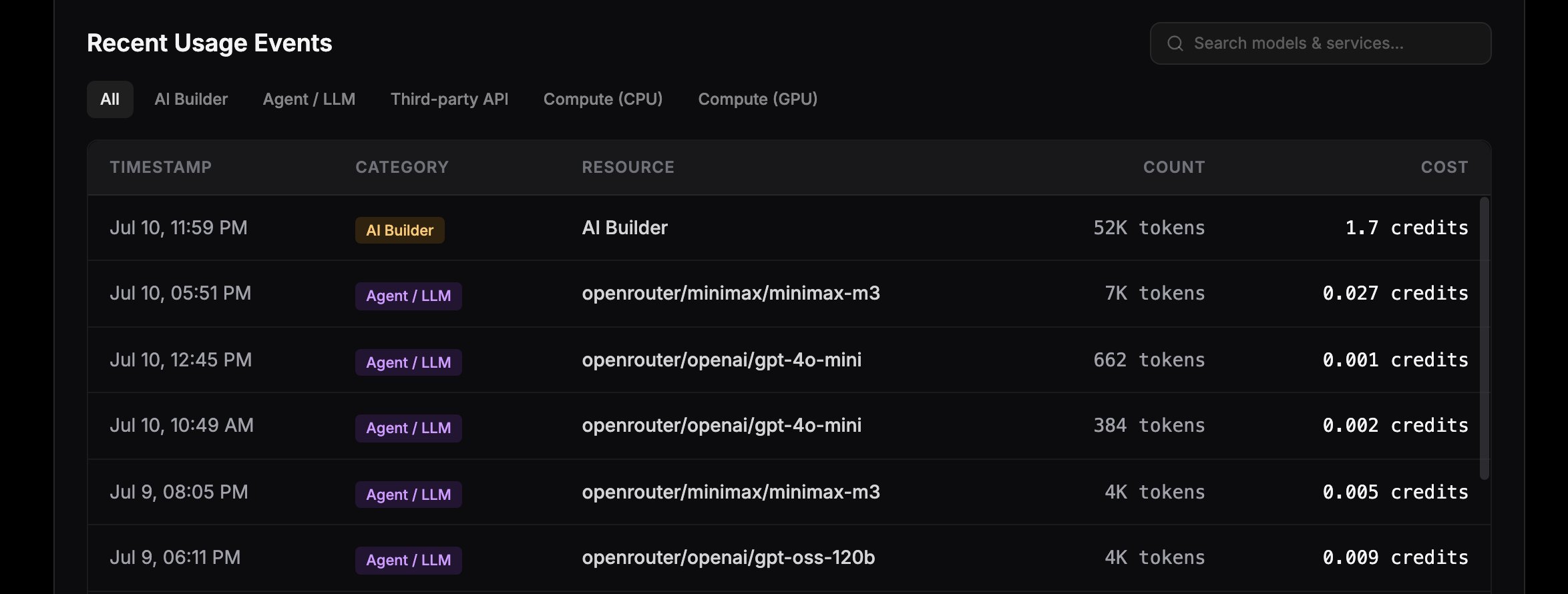
The Recent Usage Events table with category badges and per-event costs.