> ## Documentation Index
> Fetch the complete documentation index at: https://docs.noclick.com/llms.txt
> Use this file to discover all available pages before exploring further.
# App interfaces
> Build a user-facing app on top of any workflow with interface blocks in the Interface tab.
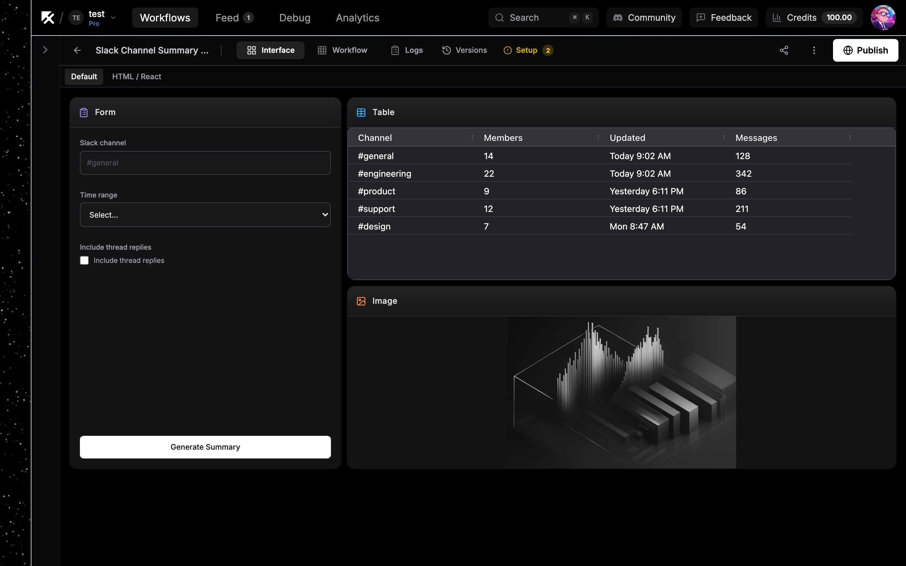
Every workflow can have an app interface: a screen with forms, tables, media, and custom components that sits on top of the workflow's logic. You build it in the **Interface** tab (shortcut `I`) in the canvas top bar, next to the **Workflow** tab (shortcut `W`).
 ## Blocks are interface nodes
The Interface tab and the canvas are two views of the same thing. Every block on the grid is an interface node on the workflow canvas:
* Dropping a block onto the grid creates the matching node on the canvas.
* Deleting a block removes its node, and deleting the node removes the block.
* Connecting workflow nodes into an interface node feeds the block data. A Multimedia block wired to an image generation node shows the generated image after a run.
Drag a block from the palette onto the grid, or click it to add it. See [Interface blocks](/apps/blocks) for what each block does.
## The grid
Blocks sit on a free-form grid. Drag a block to move it, drag its edges to resize it, and the grid prevents overlaps by pushing neighbors out of the way. On narrow screens the grid reflows to fewer columns so blocks wrap instead of shrinking.
## Fullscreen blocks and tabs
Some blocks take over the whole view instead of sitting on the grid:
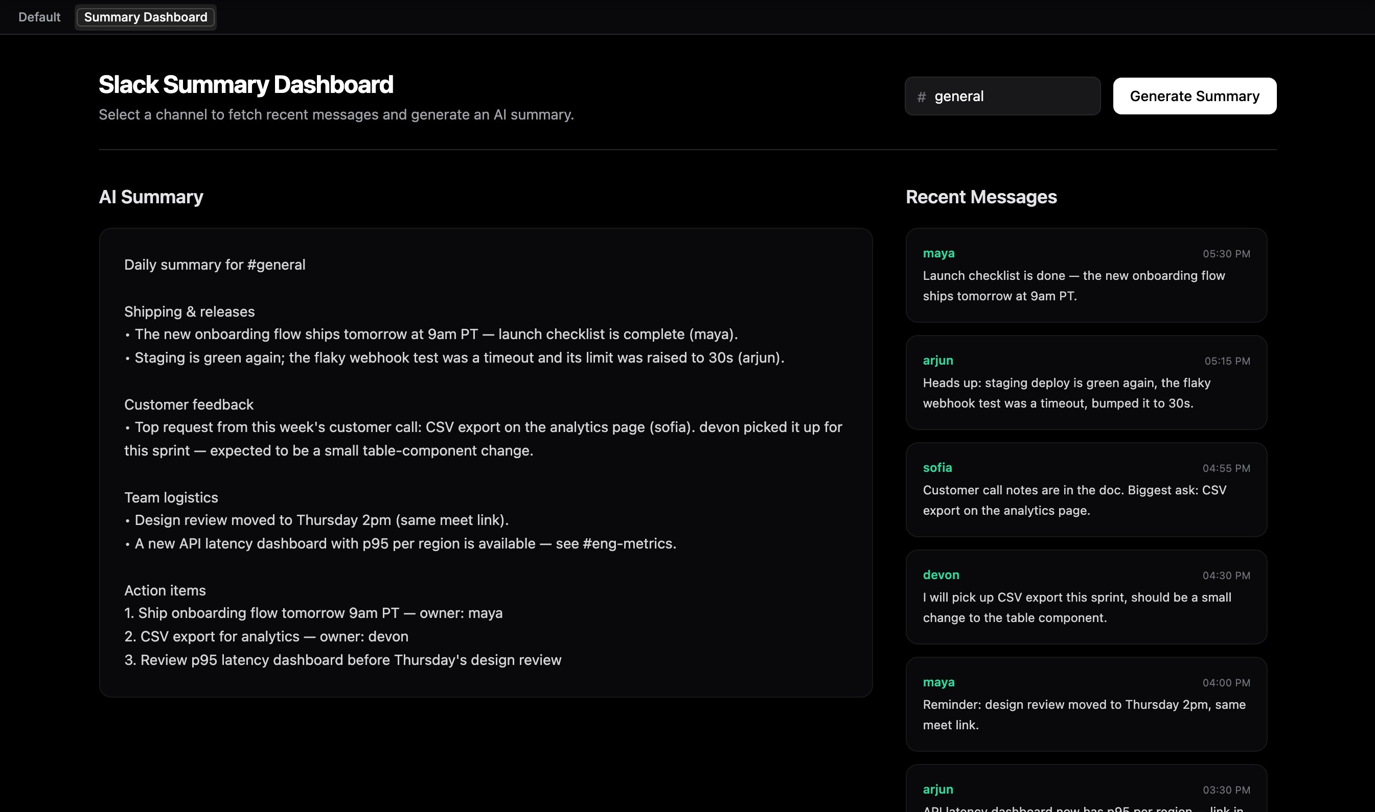
* **HTML / React** blocks are fullscreen by default. Set the block's **Fullscreen** option to **No** to place it on the grid instead.
* **Agent Chat** blocks (an agent node with **Show in Interface** enabled) are always fullscreen.
When you mix fullscreen blocks with grid blocks, a tab bar appears: a **Default** tab for the grid plus one tab per fullscreen block. Click the active tab's name to rename it, and drag tabs to reorder them. A single fullscreen block with an empty grid fills the view directly, with no tab bar.
## Blocks are interface nodes
The Interface tab and the canvas are two views of the same thing. Every block on the grid is an interface node on the workflow canvas:
* Dropping a block onto the grid creates the matching node on the canvas.
* Deleting a block removes its node, and deleting the node removes the block.
* Connecting workflow nodes into an interface node feeds the block data. A Multimedia block wired to an image generation node shows the generated image after a run.
Drag a block from the palette onto the grid, or click it to add it. See [Interface blocks](/apps/blocks) for what each block does.
## The grid
Blocks sit on a free-form grid. Drag a block to move it, drag its edges to resize it, and the grid prevents overlaps by pushing neighbors out of the way. On narrow screens the grid reflows to fewer columns so blocks wrap instead of shrinking.
## Fullscreen blocks and tabs
Some blocks take over the whole view instead of sitting on the grid:
* **HTML / React** blocks are fullscreen by default. Set the block's **Fullscreen** option to **No** to place it on the grid instead.
* **Agent Chat** blocks (an agent node with **Show in Interface** enabled) are always fullscreen.
When you mix fullscreen blocks with grid blocks, a tab bar appears: a **Default** tab for the grid plus one tab per fullscreen block. Click the active tab's name to rename it, and drag tabs to reorder them. A single fullscreen block with an empty grid fills the view directly, with no tab bar.
 ## Next steps
Reference for every block type and its configuration.
Build fully custom React UIs with the HTML / React block.
Put your app on a public noclick.app subdomain.
Let the AI builder generate the interface for you.
## Next steps
Reference for every block type and its configuration.
Build fully custom React UIs with the HTML / React block.
Put your app on a public noclick.app subdomain.
Let the AI builder generate the interface for you.