> ## Documentation Index
> Fetch the complete documentation index at: https://docs.noclick.com/llms.txt
> Use this file to discover all available pages before exploring further.
# Custom components
> Run fully custom React components in your app with the HTML / React block.
The **HTML / React** block renders your own code inside the interface. It has two modes:
* **HTML**: raw HTML rendered as-is.
* **JSX / React**: a full React component. JSX is transpiled automatically, Tailwind CSS classes work out of the box, and npm packages resolve via esm.sh imports.
Components run in a sandboxed iframe with the `@noclick/sdk` available, so they can execute the workflow, read node outputs, and react to run results. This is how dashboards, custom forms, and complete app frontends are built on NoClick; the AI builder typically writes these components for you when you describe the app you want.
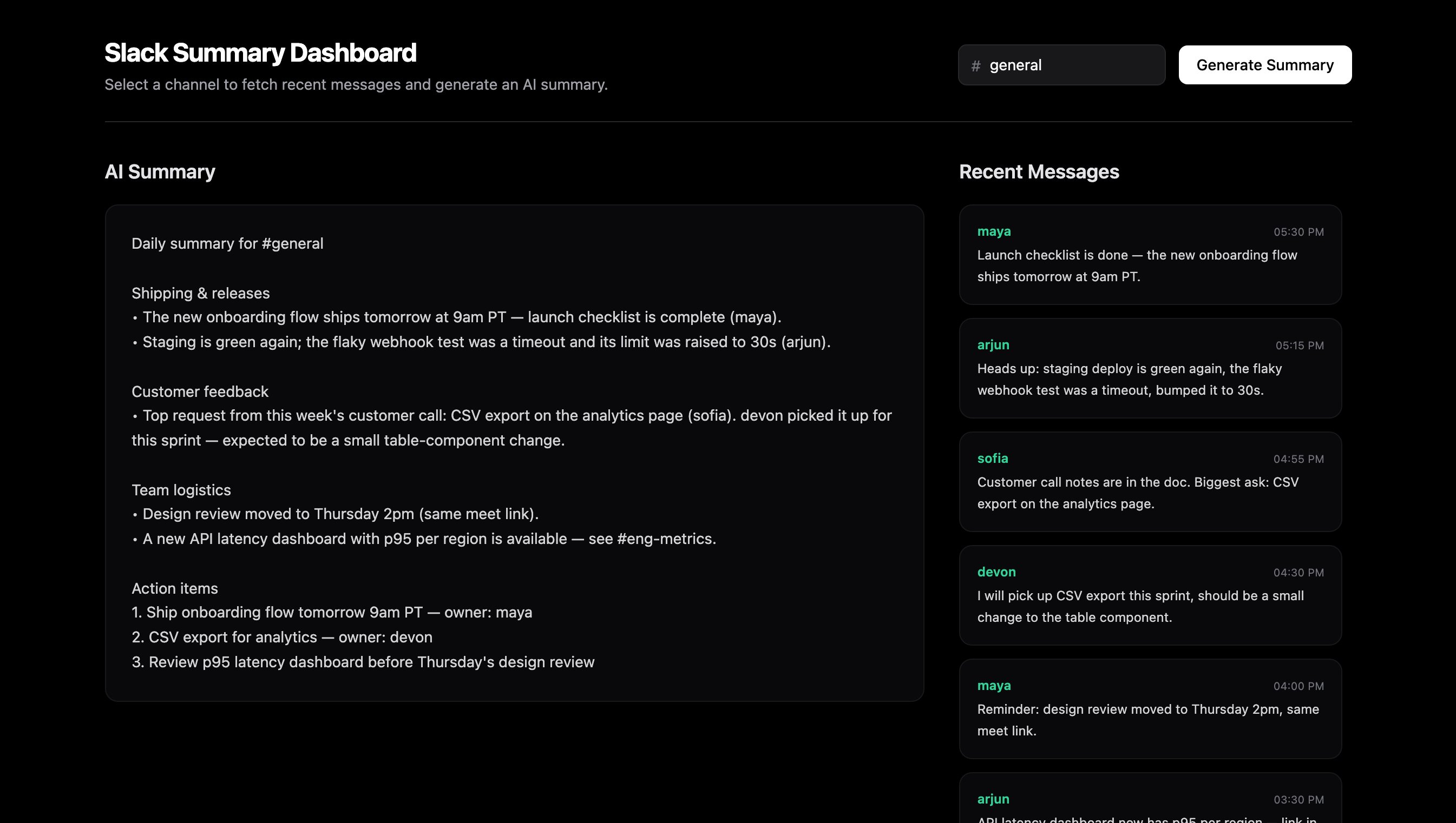 Custom components are fullscreen by default; set the block's **Fullscreen** option to **No** to place it on the grid alongside other blocks.
For the full component API, including SDK calls, imports, and working examples, see the [custom components SDK guide](/sdk/custom-components). To put a component on the public web, see [Publishing apps](/apps/publishing).
Custom components are fullscreen by default; set the block's **Fullscreen** option to **No** to place it on the grid alongside other blocks.
For the full component API, including SDK calls, imports, and working examples, see the [custom components SDK guide](/sdk/custom-components). To put a component on the public web, see [Publishing apps](/apps/publishing).