> ## Documentation Index
> Fetch the complete documentation index at: https://docs.noclick.com/llms.txt
> Use this file to discover all available pages before exploring further.
# Interface blocks
> Reference for every interface block: forms, media, tables, file uploads, and custom components.
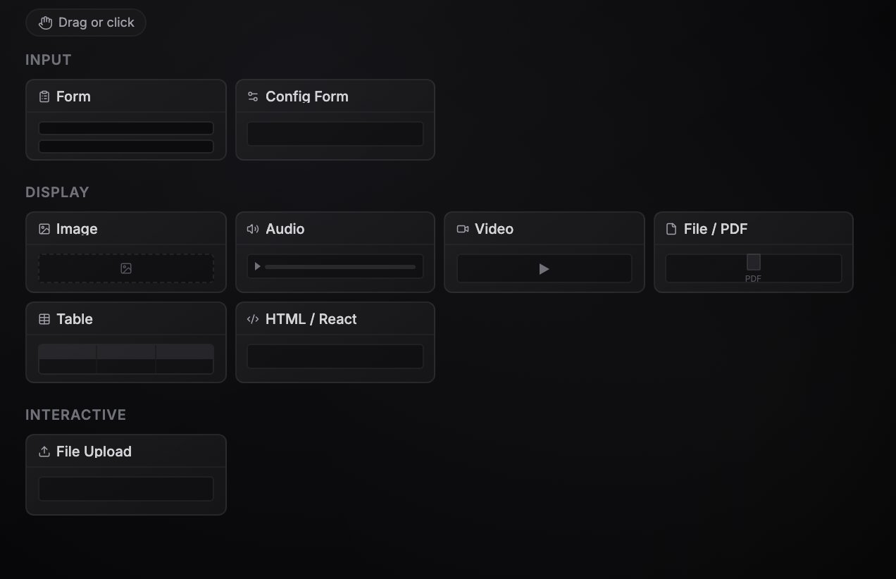
The block palette in the [Interface tab](/apps/overview) groups blocks into three categories: **Input**, **Display**, and **Interactive**. Drag a block onto the grid or click it to add it. Each block is backed by an interface node on the canvas, so you can wire workflow data into it.
 ## Input blocks
| Block | What it does | Key configuration |
| --------------- | -------------------------------------------------------------------------------------------------------------------------------------------------------------------------------------------------------------------------- | --------------------------------------------------------------------------------------------------------------------------------------------------------------------------------------------------------------- |
| **Form** | A multi-field form. Submitting it starts a workflow run from the form node, with the entered values on the node's output. | **Form Fields**: each field has a name (used in references), type (`string`, `number`, `boolean`, `object`, `array`, `select`, `credential`), label, description, required flag, and options for select fields. |
| **Config Form** | A persistent settings form. Values are saved with the workflow and output on every run, so downstream nodes can reference them as `{{node-id.values.field_name}}`. Unlike Form, it stores values instead of starting runs. | **Fields**: name, type (`string`, `number`, `boolean`, `select`, `schedule`, `list`), label, description, required flag, options, and a default value. |
## Display blocks
| Block | What it does | Key configuration |
| ---------------- | ------------------------------------------------------------------------------------------------------------------------------------------------------------------------------------------------------------------------------------------------------------------------------------------------------- | ---------------------------------------------------------------------------------------------------------------------------------- |
| **Multimedia** | Shows any file and picks the right viewer for it: an image, an audio waveform, a video player, a PDF, or a download card. It detects the kind from the file's type. After a run, the URL from the connected node's output takes priority; otherwise it shows the configured source or an uploaded file. | **Source URL**, **File Name**, or an uploaded file (drag and drop onto the block). |
| **Table** | Tabular data grid (AG Grid). Shows a saved dataset, data from an upstream node, or inline JSON rows. | **Data** (inline JSON array or a reference to upstream output), or a dataset picked from your workflow resources. |
| **HTML / React** | Renders custom HTML or a React/JSX component with Tailwind, npm packages, and SDK access. Fullscreen by default. | **Content** (HTML mode) or **JSX Source** (React mode), **Fullscreen** (Yes/No). See [Custom components](/apps/custom-components). |
## Interactive blocks
| Block | What it does | Key configuration |
| --------------- | ------------------------------------------------------------------------------------------------------------------------------------ | --------------------------------------------------- |
| **File Upload** | Drop zone with a file picker. Uploaded files are stored as workflow resources, and their resource IDs are available to the workflow. | **Accepted Types**, **Max Size (MB)** (default 10). |
There is one more block that never appears in the palette: **Agent Chat**. New AI agents appear here as a fullscreen chat tab by default. Toggle **Show in Interface** on an agent node (or click the **Chat** pill on the node) to control whether it shows. See [AI agents](/agents/overview).
## Input blocks
| Block | What it does | Key configuration |
| --------------- | -------------------------------------------------------------------------------------------------------------------------------------------------------------------------------------------------------------------------- | --------------------------------------------------------------------------------------------------------------------------------------------------------------------------------------------------------------- |
| **Form** | A multi-field form. Submitting it starts a workflow run from the form node, with the entered values on the node's output. | **Form Fields**: each field has a name (used in references), type (`string`, `number`, `boolean`, `object`, `array`, `select`, `credential`), label, description, required flag, and options for select fields. |
| **Config Form** | A persistent settings form. Values are saved with the workflow and output on every run, so downstream nodes can reference them as `{{node-id.values.field_name}}`. Unlike Form, it stores values instead of starting runs. | **Fields**: name, type (`string`, `number`, `boolean`, `select`, `schedule`, `list`), label, description, required flag, options, and a default value. |
## Display blocks
| Block | What it does | Key configuration |
| ---------------- | ------------------------------------------------------------------------------------------------------------------------------------------------------------------------------------------------------------------------------------------------------------------------------------------------------- | ---------------------------------------------------------------------------------------------------------------------------------- |
| **Multimedia** | Shows any file and picks the right viewer for it: an image, an audio waveform, a video player, a PDF, or a download card. It detects the kind from the file's type. After a run, the URL from the connected node's output takes priority; otherwise it shows the configured source or an uploaded file. | **Source URL**, **File Name**, or an uploaded file (drag and drop onto the block). |
| **Table** | Tabular data grid (AG Grid). Shows a saved dataset, data from an upstream node, or inline JSON rows. | **Data** (inline JSON array or a reference to upstream output), or a dataset picked from your workflow resources. |
| **HTML / React** | Renders custom HTML or a React/JSX component with Tailwind, npm packages, and SDK access. Fullscreen by default. | **Content** (HTML mode) or **JSX Source** (React mode), **Fullscreen** (Yes/No). See [Custom components](/apps/custom-components). |
## Interactive blocks
| Block | What it does | Key configuration |
| --------------- | ------------------------------------------------------------------------------------------------------------------------------------ | --------------------------------------------------- |
| **File Upload** | Drop zone with a file picker. Uploaded files are stored as workflow resources, and their resource IDs are available to the workflow. | **Accepted Types**, **Max Size (MB)** (default 10). |
There is one more block that never appears in the palette: **Agent Chat**. New AI agents appear here as a fullscreen chat tab by default. Toggle **Show in Interface** on an agent node (or click the **Chat** pill on the node) to control whether it shows. See [AI agents](/agents/overview).